Style Guide: Color Coordinating for a Family Photo Session
Dressing yourself for a photo shoot is a little more demanding than dressing for a day at the office. You have a significantly restricted pallet when it comes to patterns for one; busy or bold patterns such as checked skirts, striped shirts, or floral dresses do not typically photograph well. Not being able to wear a particular dress may be frustrating but it's no big deal. The real fun begins when you are in charge of coordinating the clothing of your entire family.
You've got to make sure that Dad's pants match Sally's dress, that Sally's dress matches your blouse, and that your blouse matches Timmy's sweater. All this can drive a person mad. At this point you've got two options: you can pop open that bottle of xanax and curl up in the corner (which is a thing we all do, right?), or you can read this blog and learn that that by following a few simple guidelines you can dress your family like a seasoned Hollywood stylist. So, read on and save the pills for another day.
Before we dive in to the good stuff let's get this out of the way first, 'matchy-matchy' is not the answer. Everyone wearing a black button up and jeans, ooh, and barefoot... NO! Every family, including ours, does at least one shoot in which everyone is wearing the same color. This is extremely dated. The message you will send with these photos is that your family is not unique or interesting, and you've even decided to advertise it. Not the ideal image for your family.
OK, moving on.
To get a better understanding of how to get your family looking like you belong on the cover of a Vanity Fair, we must go back to 1666. Just kidding, no time travel necessary! But you should be familiar with the color wheel and color theory.
The color wheel was indeed invented in 1666 by Sir Isaac Newton when he refracted light beams with a prism - science!
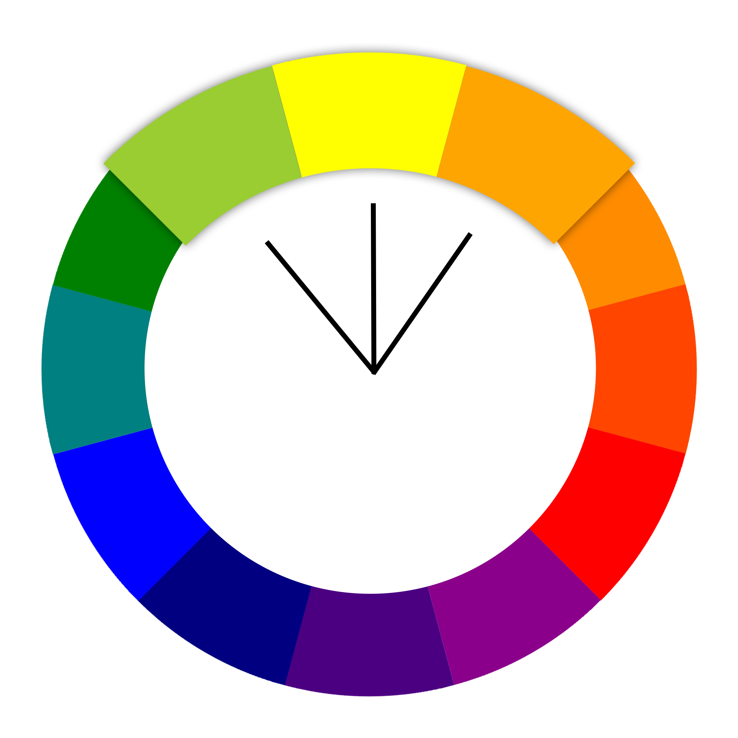
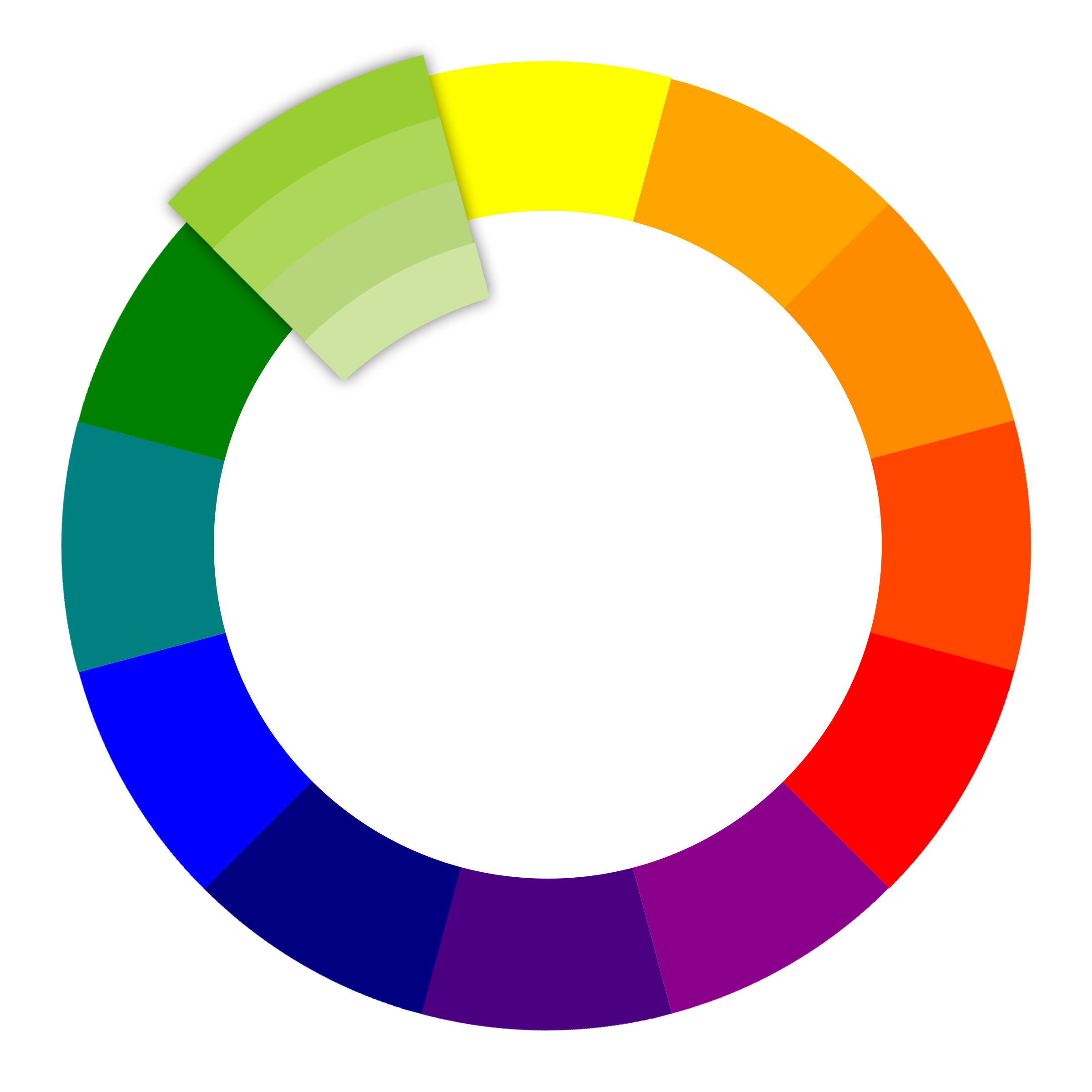
Color Wheel
Primary Colors
Primary colors are the foundation of all other colors, these colors can not be created by mixing other colors together. They are Yellow, Blue, and Red.
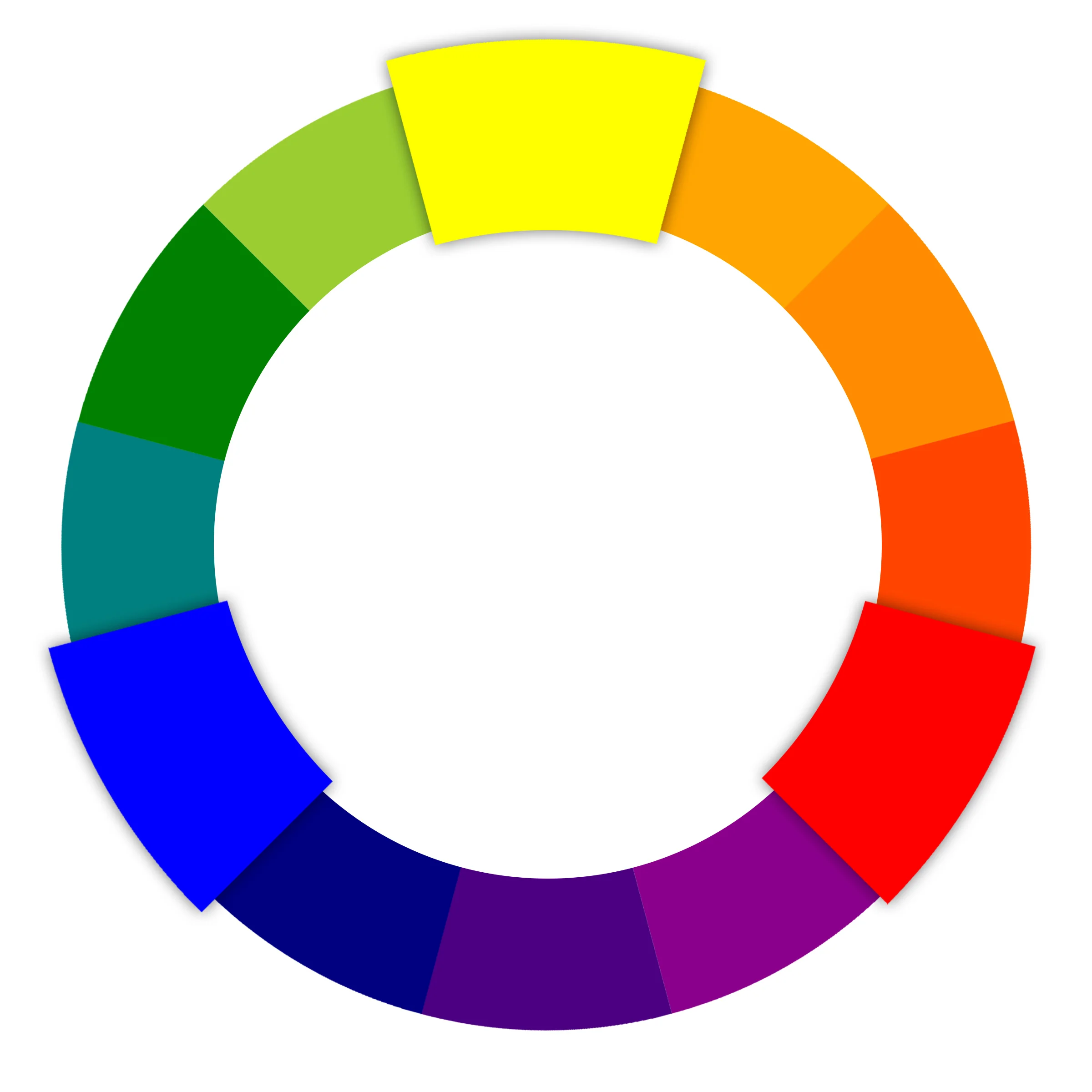
Secondary Color
Secondary colors are created by mixing two primary color. Yellow + Blue = Green Blue + Red = Purple, , Red + Yellow = Orange.

Tertiary Colors
Tertiary colors are a created by mixing a primary color with a secondary color. Yellow + Green = Yellow-Green, Blue + Green = Blue-Green, Blue + Purple = Blue Purple, Red + Purple = Red-Purple, Red + Orange = Red-Orange, Yellow + Orange = Yellow-Orange.
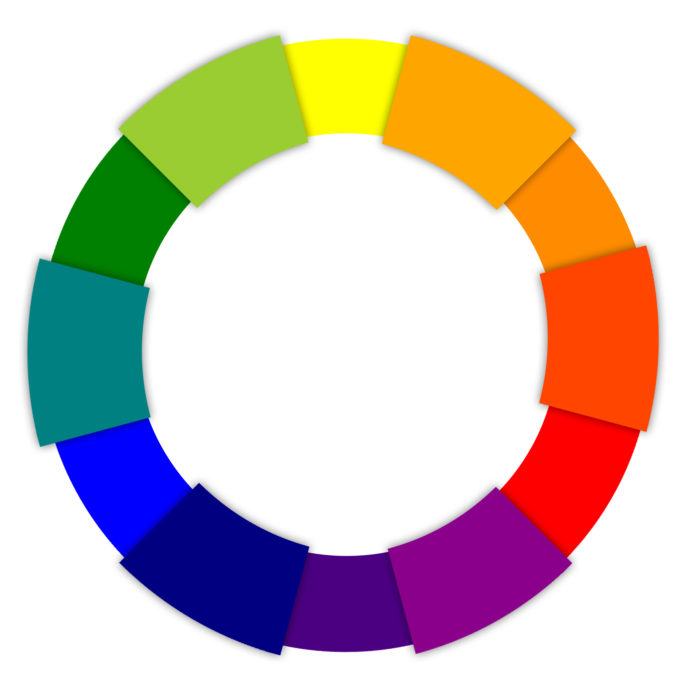
Tint and Shade
A quick note on tint and shade. The tint of a color is altered by adding white to it, lightening it. Shade is changed by adding black, darkening it. For simplicity's sake (it has nothing to do with me being lazy) I did not include different shades in my color wheels, except for the graphic below, related to monochromatic color scheme.
Neutral Colors
Neutral colors are not typically found on the color wheel, they include black, white, grays, and browns (blue and green are often included as well). Neutral colors are sometimes referred to as "earth tones" due to the fact they are colors you're most likely to see in rocks, sand, dirt, and clay.

I consider blue to be a neutral color because of its prominence in a wardrobe. I do not consider green to be a neutral color for the opposite reason, green is not a fundamental color within a wardrobe.
Color Combos
Color Theory
Color theory is a set of guidelines for matching colors, and it's our primary (pun intended) focus (oops, there's another one!). It's a huge topic that even encompasses the psychological effects color has on people. I can not begin to cover it in its totality (while doing research for this blog I was sucked down a YouTube wormhole). What we are concerned with is color scheme (color combinations), of which we will look at four.
Complementary
Complementary colors are colors directly across from one another on the color wheel.

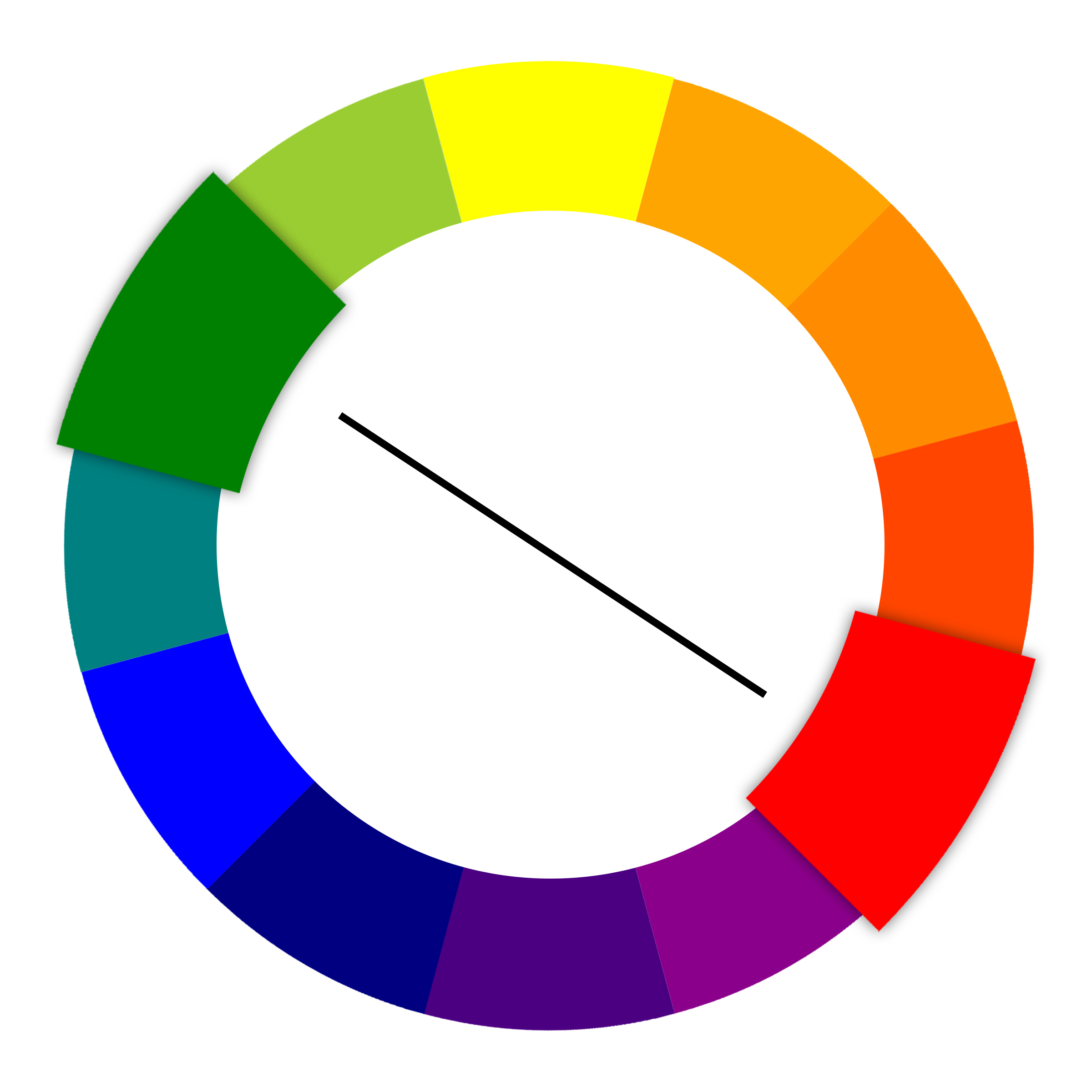

Complementary colors are the most contrasting colors, and therefor make a bold statement. Choose a base color (e.g. Blue) and then use its complementary color for a pop of color. If your goal is to blend in, avoid this color scheme.
Triadic
Triadic colors are three colors equally separated on the color wheel.

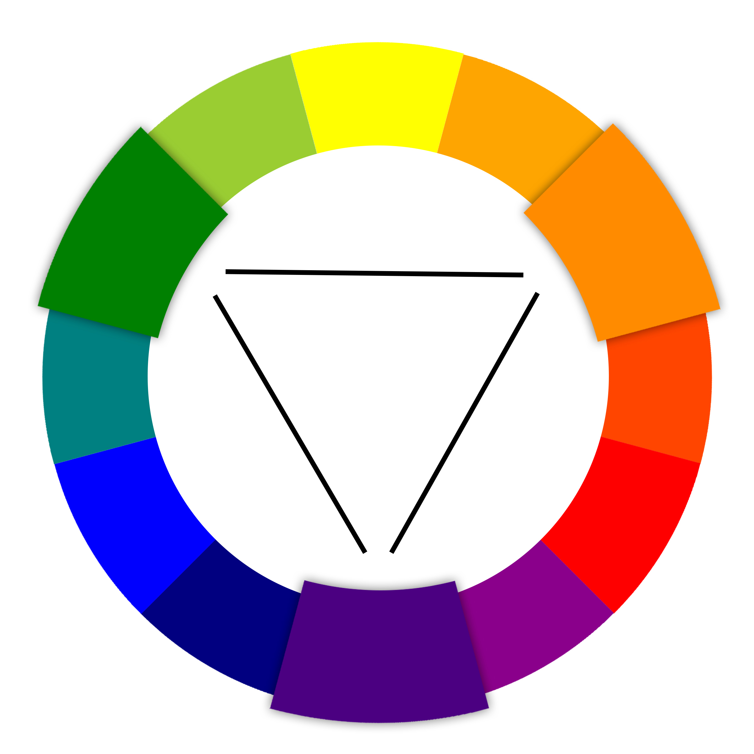

While not as contrasting as complementary colors, the triadic color scheme is still bold and tends to be very vibrant. Again, the best practice is to select one color to be more prominent and use the other two as accents.
Analogous
Analogous colors are a color and its two adjacent colors on the color wheel.


Unlike the other color schemes we've looked at, analogous colors have less contrast and make a subtler statement.
Monochromatic
Monochromatic colors are actually a single color with lighter and/or darker variations.


While this is close to the 'matchy-matchy' color scheme mentioned earlier it is more acceptable. Though, still best reserved for a single individual and not an entire family. This color scheme is particularly great for newborn shoots!
Making Sense of it All
While this seems like a lot to keep track of, it's really only a few guidelines and they're based on simple concepts. Don't worry about remembering what analogous means, just remember the color scheme. When experimenting with different variations start with a neutral base and go from there. When adding accent colors stick to accessories to help ease you in to a more colorful look.
Here are a few examples to help you how these color schemes can be implemented.
Family #1
Base colors: Cream. Accent colors: Blue and Brown
Mom: Cream Dress, Bronze Necklace, Cream Shoes
Dad: Gray Pants, Light Blue Shirt, Brown Shoes
Daughter: Light Blue Dress, Cream Shoes
Son: Khaki Pants, Blue shirt, Brown Shoes
Dressing in neutral colors only is easy and looks great.

FAMILY #2
Base color: Red-Orange. Accent colors: Red and Orange
Mom: Red-Orange Dress, Brown Shoes
Dad: Brown Pants, White Shirt, Brown Shoes
Daughter: Light Orange Dress, Brown Shoes
Son: Khaki Pants, White Shirt, Red Sweater, Brown Shoes
This is based on the analogous color scheme.

Family #3
Base color: Navy. Accent colors: Yellow and Red.
Mom: Navy Dress, Light Blue Necklace, Navy Shoes
Dad: Gray Jacket, Navy Pants, White Shirt, Red Pocket Square, Brown Shoes
Daughter: Light Blue Dress, Red Belt, Yellow Hair Ribbon, Navy Shoes
Son: Navy Jacket, Gray Pants, White Shirt, Yellow Pocket Square, Brown Shoes
This is based on the triadic color scheme.

In summation, pick one color as the foundation, use one or two accent colors (complementary, triadic, or analagus), and allow neutral colors and/or tints or shades of your foundation color (monochromatic) to keep it all together. And remember, dressing an entire family takes a bit more planning and patience than dressing yourself but it's worth the effort.